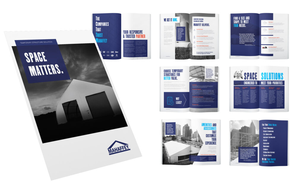
I first started working with Mahaffey in 2017 after they contracted RedRover to work on some mailers that they had paid for without having artwork. Cart before horse, right? That’s the case more often than one might hope.
A big part of what I do is to take a bunch of disparate ideas and collect them under one identifiable brand. The goal of a brand is to be so recognizable that if you produce something that is eye-catching anyone can identify you again when they see you the next time.
Scope
- Advertisement
- Photography
- Branding
- Graphic Design
- Photography
- Magazine Layout
- Vendor Management
The Results
When I see blue, I now think of Mahaffey.
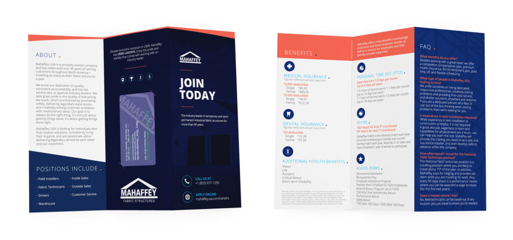
Blue was always the case. What we tried to do was to break it up. I used different textures and shapes to set apart any images we might be using. Luckily, a big early project was developing their brochure. A big part of the brand began to take shape.
Over the last four years I have worked with the team at Mahaffey on countless emails and website updates, headshots for their team, and updating old brochures. They are absolutely at the top of the temporary structures game, and the crew they have are absolutely aces.
