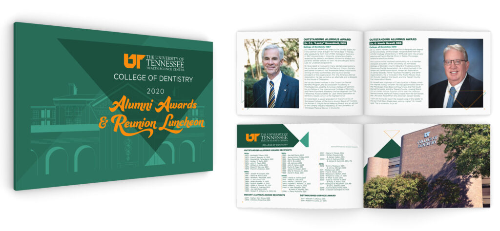
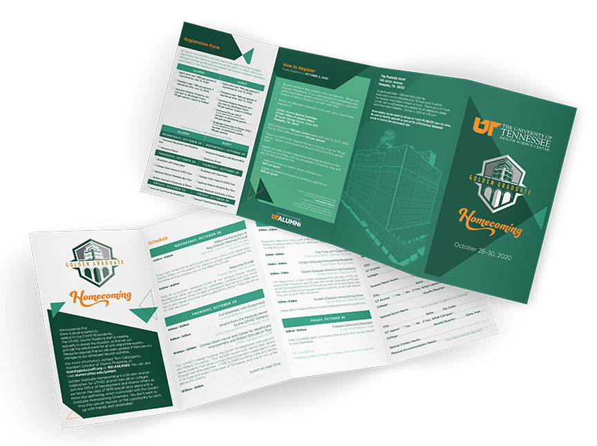
When I had my initial discovery meeting with the team at UTHSC Foundation, I found that no one there had really considered how they wanted to look. Their main job is to pull in money from graduates to fund current programs at the University of Tennessee Health Science Center. If they aim to do that, we have to get people to actually look at the materials we are sending out.
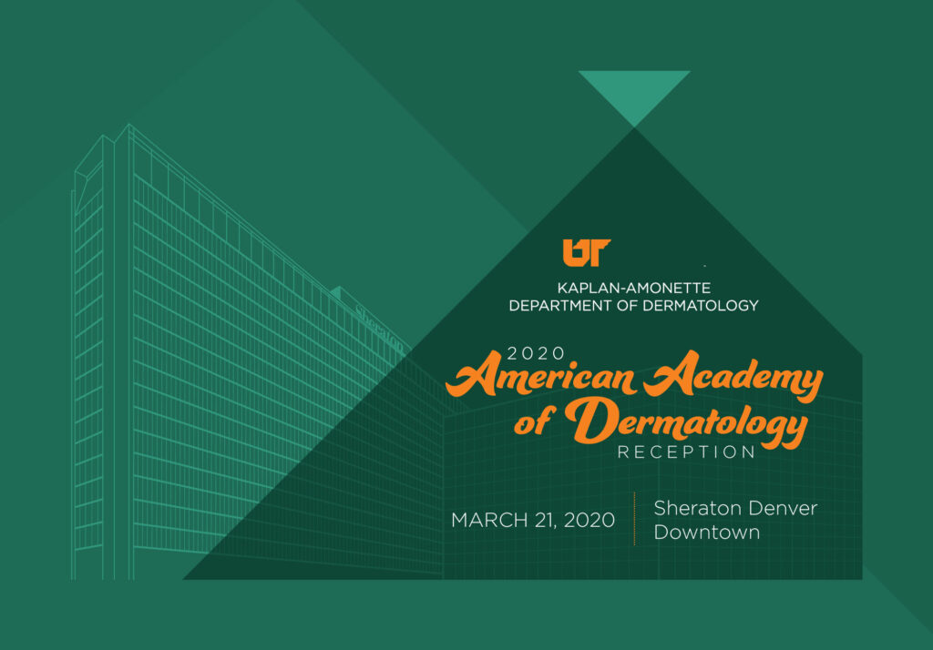
I’m sure I’ll repeat myself lots on this site, but my main goal is to always make something cool. If I don’t think it is cool, then it’s very likely that no one else will either. Credit where it is due — my counterpart for many years, Jesse Lorentz, came up with the idea of setting an object in the foreground of this style, and then having triangular shapes move around a “grid” to fill in the space. I took that idea and combined it with some architectural drawings of UTHSC buildings, then Memphis buildings, then eventually buildings from various events UTHSC was hosting across the country.
Scope
- Branding
- Photography
- Design
The Results
Why would you send mail that no one cared to read?
I took what they had — color scheme, fonts, all the parts of the existing brand that connects them with the University and I tweaked it. What we wound up with was modern, sleek, and attractive.
Something as old and distinguished as a Medical University can take forever to move in one direction. We were able to focus what they wanted into a few small pieces to get the ball rolling. I retouched some old logos for them and I worked up a new on for the Corporate Exchange. The clients were wowed and I was absolutely thrilled.


