Being in this field means that I can’t be content with who I think I am at any given moment. If my job was to only create things that I liked I’m sure I wouldn’t have made it very far. So, when RedRover took on an NCLEX® training outfit I had to learn about nursing exams very quickly.
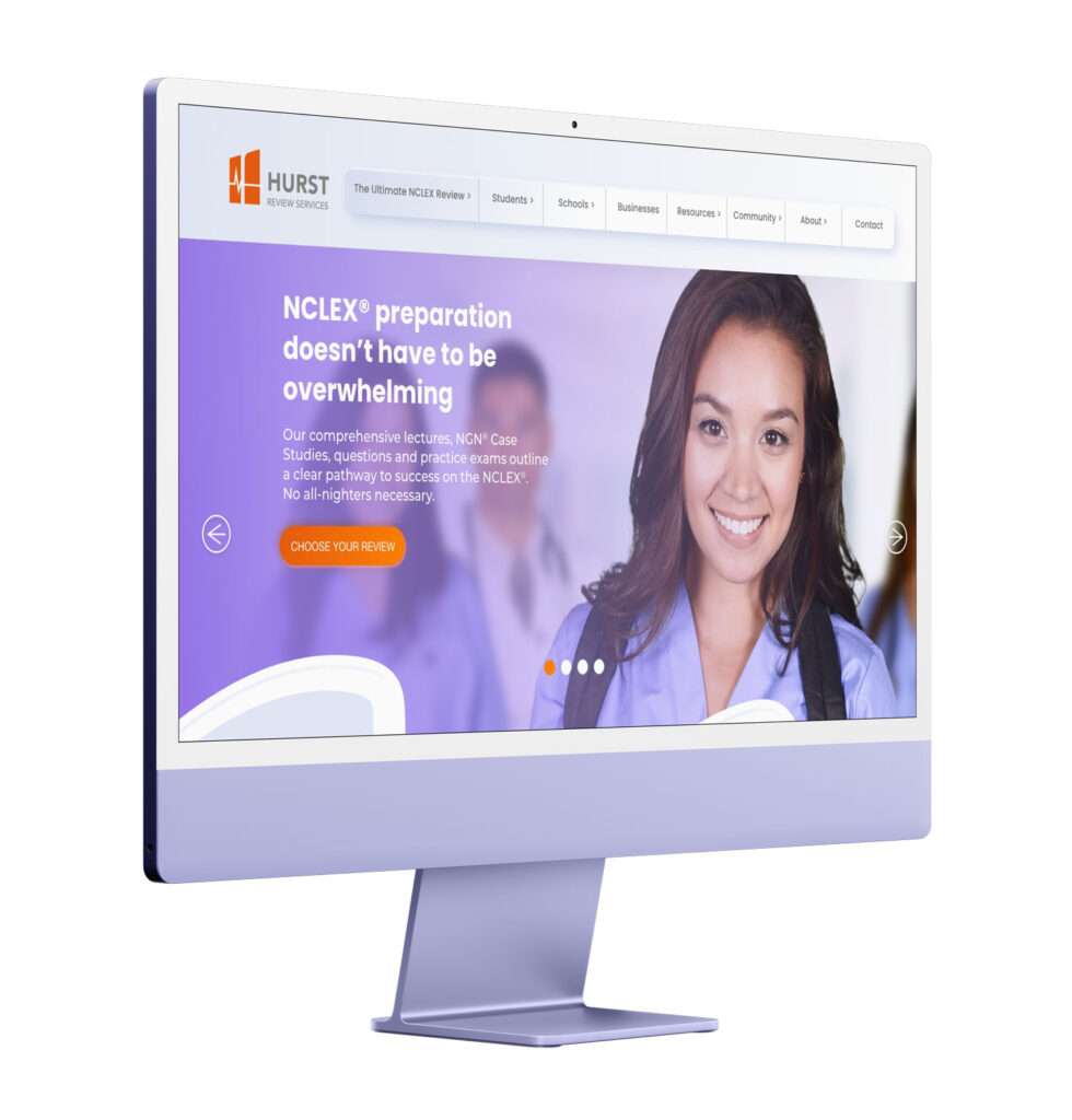
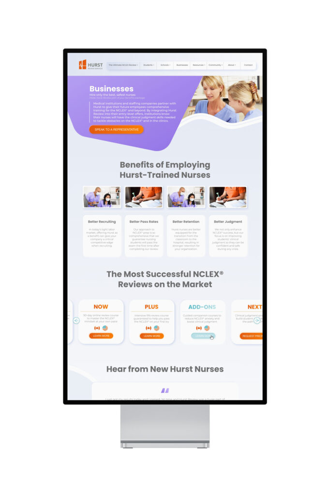
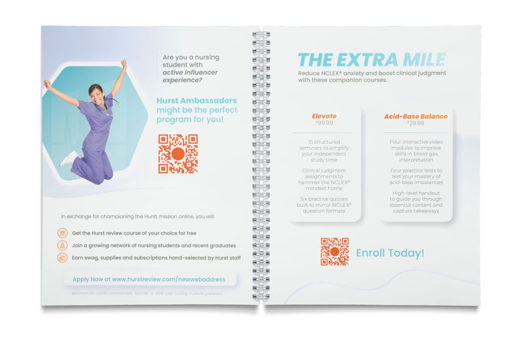
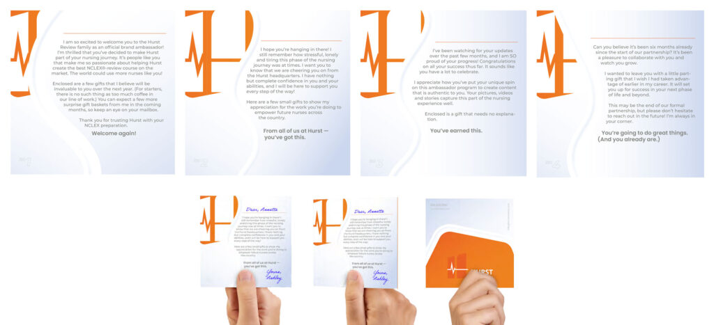
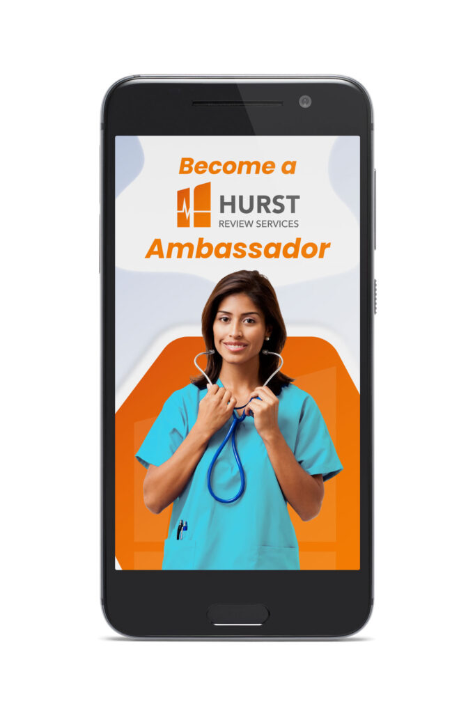
I always stage a kick-off meeting with any new client — we discuss likes, dislikes, their vision for the future of their company, and so on. Hurst was in a place where they really hadn’t updated anything in many years. So, what began as a website refresh became a new brand identity.
Scope
- Brand Identity
- Photography/Photoshop
- Web Design
- Google Ads
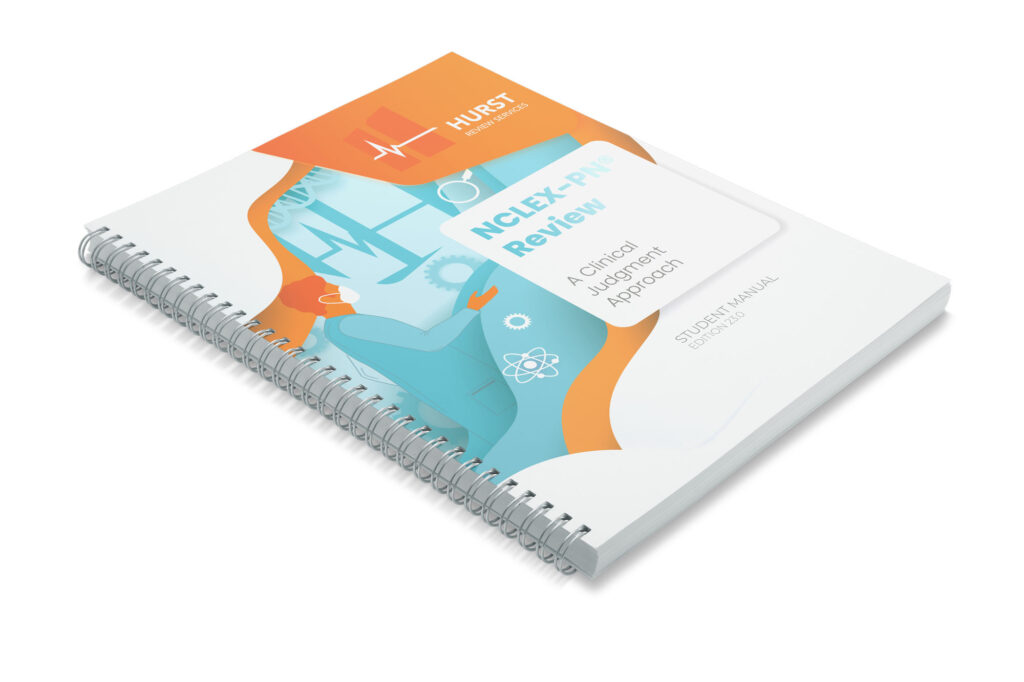
- Book Covers
Project Outcome
A Brand New Brand
Hurst is a rapidly growing company. The work that is coming out right now is born from a need to replace everything they have been using over the years. I completed a brief brand refresh based on a style called “neomorphism” that I have seen over the last few years. It reminds me of the cleanliness of hospitals — I thought it worked perfectly here.
Amazing Results
This project continues to grow, and the agency of record here (RedRover) is happy to continue to provide award-winning service. I feel like I know the brand now. It’s not easy to completely refresh a brand under any timetable, but in this case we began this project in April and the website ought to be live by mid-September. That feels fast to me. Whew!
